Product design · EV Charging
SureChargeX
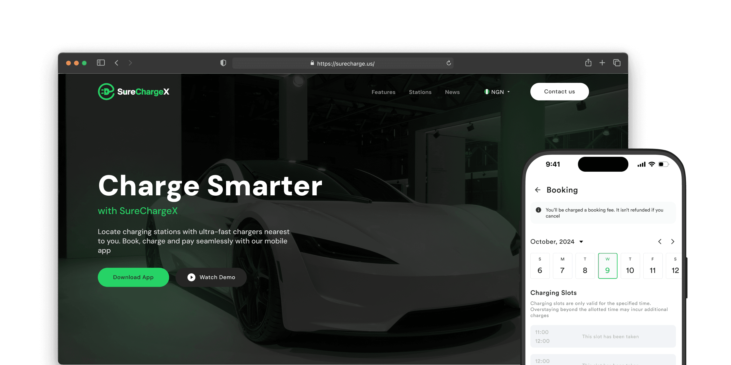
A mobile app and website for Ashipa Electric that let EV drivers find a station, reserve a charging slot, pay and charge in one journey, with every cost shown before they commit.
In short
Ashipa Electric’s brief was clear on features and open on the hard questions: should drivers need a code to confirm payment, should pricing be by time or energy, do drivers have to be at the station for their whole slot? I answered those in the design: slot-based booking with a full cost breakdown before payment, a wallet secured by a 4-digit PIN, and charging screens built for a driver standing at the charger.
When a private EV owner and his fleet drivers tested the app, they found the cancellation information wasn’t good enough, so I made the fee, refund eligibility and timing explicit, and showed the fee before and during cancelling.
The brief
The brief left the hard questions open
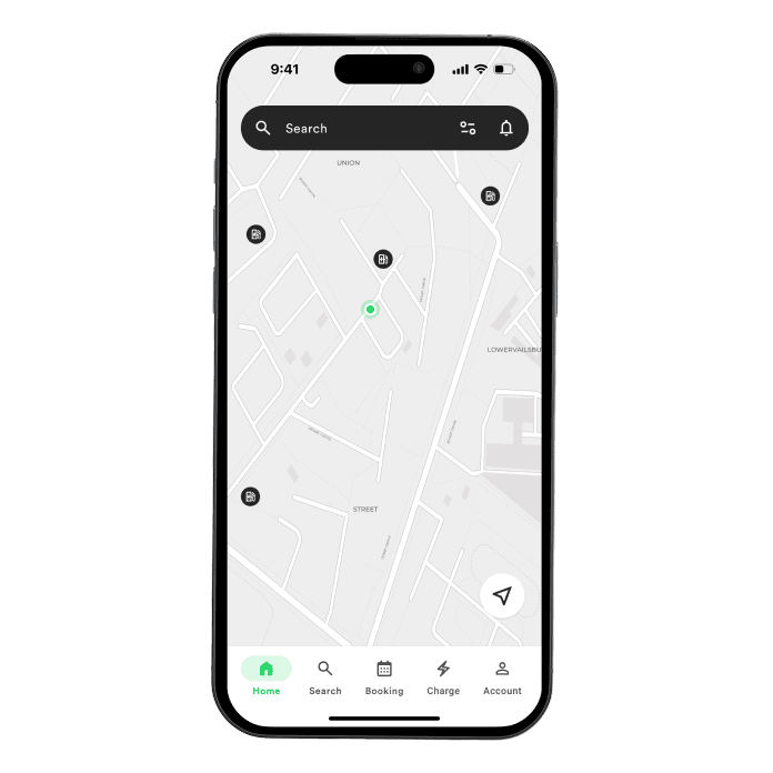
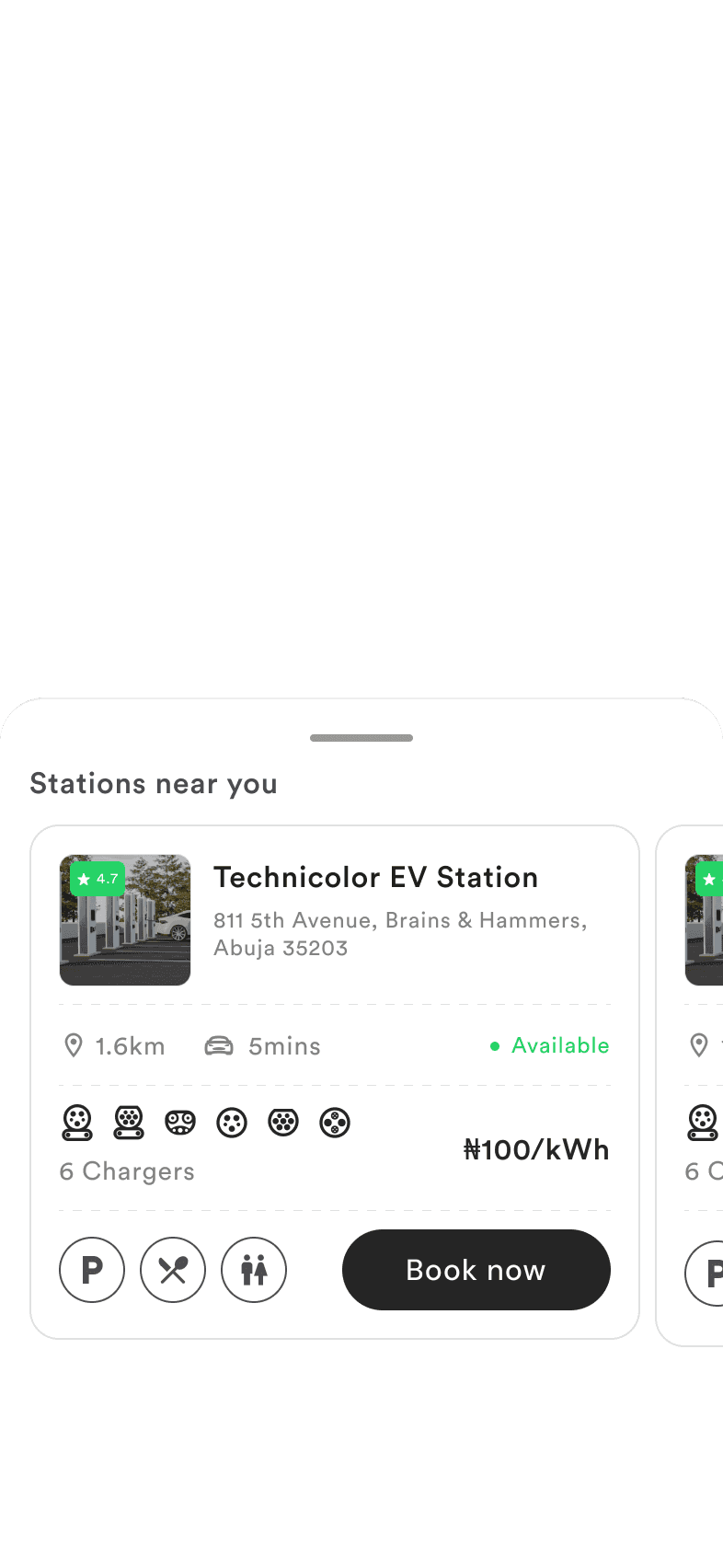
The brief from Ashipa Electric was for Phase 1 of a charging platform: a driver app and a web console for operators. For drivers, it asked for search within a set radius, station details, time-slot booking, wallet payment for the slot, payment for energy used, and starting and stopping a charge from the app.
It also listed five open questions, and those are where the design work was:
- Do drivers charge by themselves or with attendants?
- If by themselves, should they need a code to confirm identity and payment?
- Should pricing be by time, energy used, or charger type?
- Do metrics matter, and to whom?
- Does a driver have to be at the station for their whole slot?
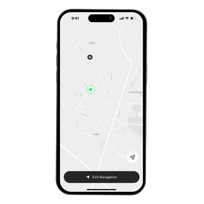
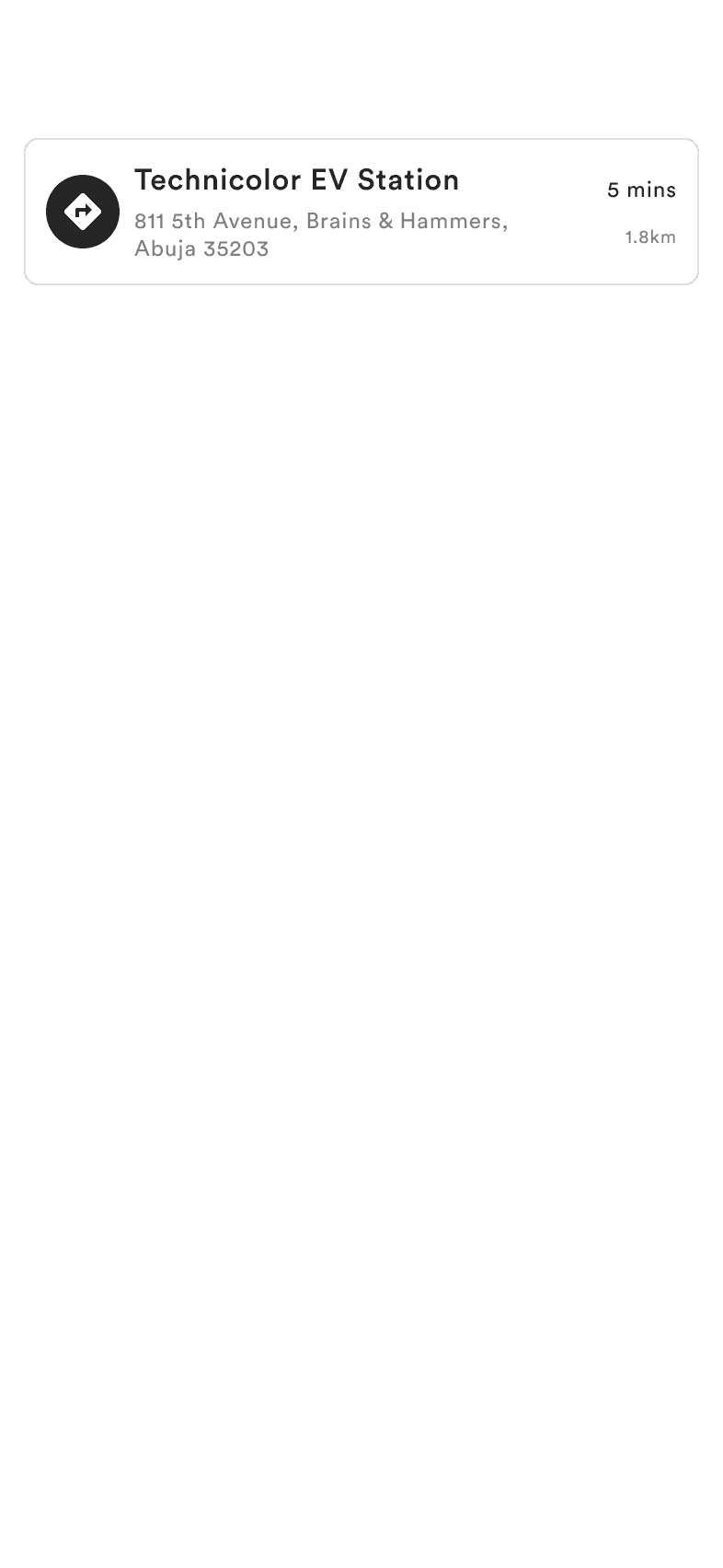
Finding a charging station is only the beginning. Drivers also need to check station details, book a session, pay, and follow their charging progress, and the journey has to hold up when they cancel, change plans, or come back.


Research
Learning from international products and standards
I hadn’t found a local equivalent to learn from, so I looked at international products and standards.
The US National Electric Vehicle Infrastructure (NEVI) standards for public chargers require real-time station status, uptime, real-time pricing with any extra costs “displayed and explained”, hours of availability, port and connector types, and multiple payment methods. I used them as a checklist for what each station screen must answer.
I also reviewed the leading US driver apps:
| App | Strong at | Where the journey breaks |
|---|---|---|
| PlugShare | Discovery: map, plug filters, reliability scores | No booking |
| ChargePoint | A Waitlist queue at busy stations | No advance booking |
| Electrify America | Live availability and in-session progress | No reservations; you find out on arrival |
| EVgo | Reservations and a vehicle garage | Select locations only, with late cancellation and no-show fees |
The pattern: booking is usually an add-on at a few sites, and where it exists, its rules (fees, hold windows, no-shows) are where drivers’ trust is won or lost. SureChargeX needed booking as the backbone, with its rules visible before anyone pays. These references could not tell me how our own drivers would behave, which is why testing with real drivers mattered later.
The station screen, checked against NEVI
Each number marks a requirement the screen answers before a driver books.
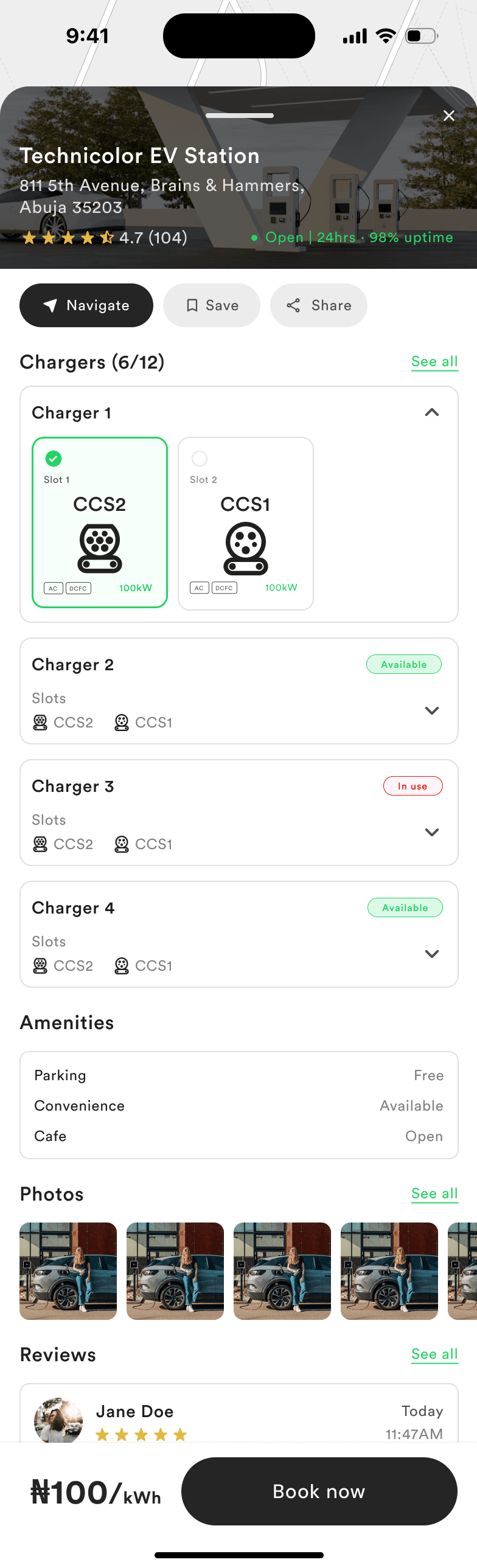
- Hours of availability“Open | 24hrs” sits in the header.
- Uptime“98% uptime” sits next to the hours, so drivers can judge reliability before the trip.
- Real-time availabilityChargers available out of the total, “6/12”.
- Connector typesEach slot names the connector it supports.
- PowerEach slot shows its charging power.
- Real-time statusEvery charger is marked Available or In use.
- Extra costs, displayedThe parking fee and amenities, before booking.
- Real-time pricingThe price per kWh sits on the booking bar.
Finding a charger is one step. The experience needs to carry you through the whole charge.
Decision 1
Book a slot, see every cost before paying
The brief asked for slots in time ranges, so booking is built around a day and hour picker. Each slot shows its state: taken, selected, or “Tap to book this slot”. Above the slots, one line answers whether drivers must stay for the whole slot: “Charging slots are only valid for the specified time. Overstaying beyond the allotted time may incur additional charges.”
On pricing, the design uses both models the brief described: a booking fee reserves the slot, and the driver pays for the energy they use. Before confirming, the booking summary shows the charger and slot, connector and power, date, time and duration, parking fee, booking fee, tax and an estimated total, and drivers can change their vehicle or payment method from there. The first time a driver sees a price is not at the charger.
From station to confirmed booking
Every cost appears before the driver pays.
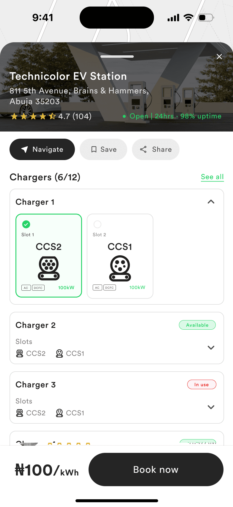
1 Pick a chargerConnector and power on each slot
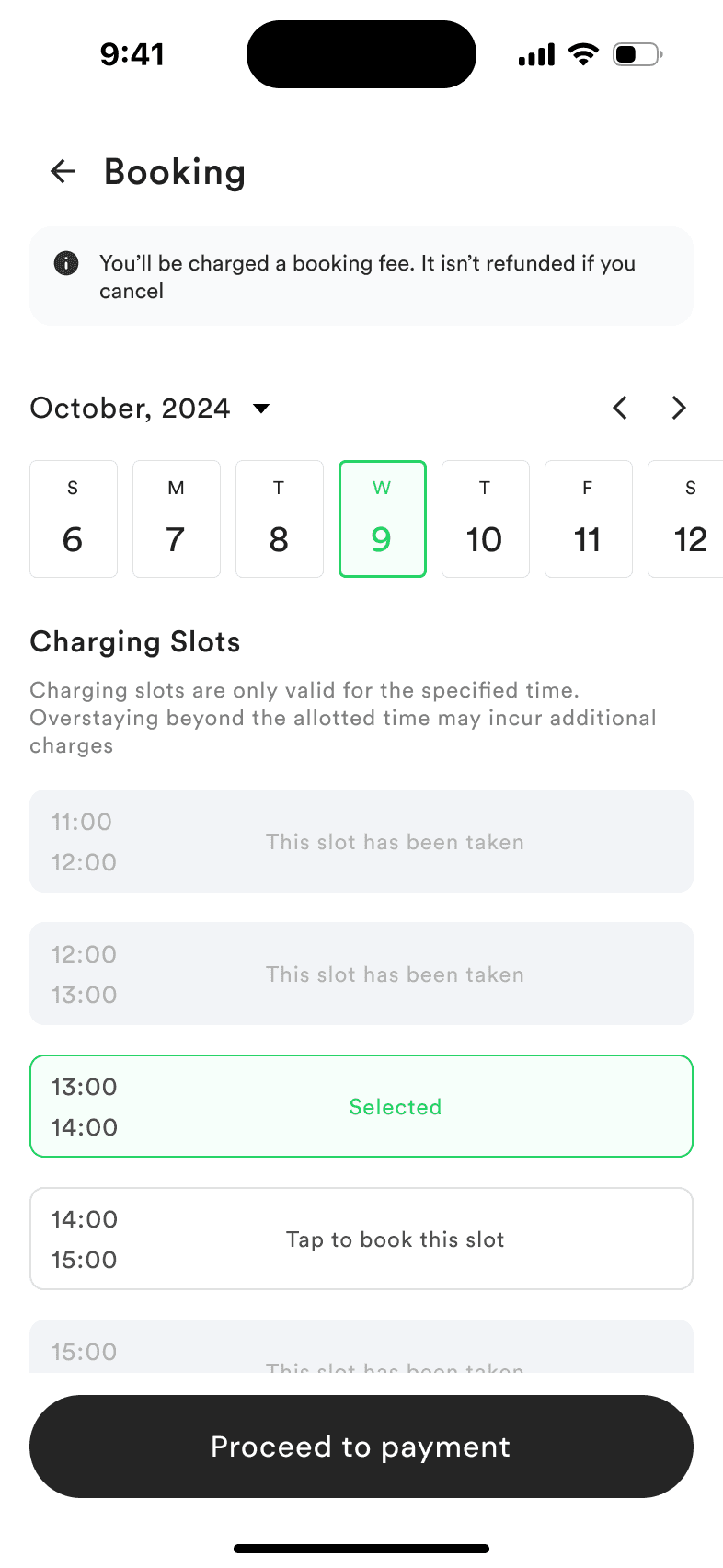
2 Choose a slotThe fee and the overstay rule, up front
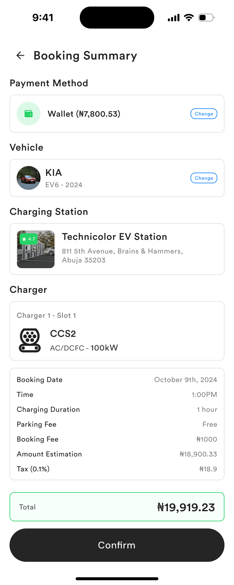
3 Review every costFees, tax and the estimate before confirming
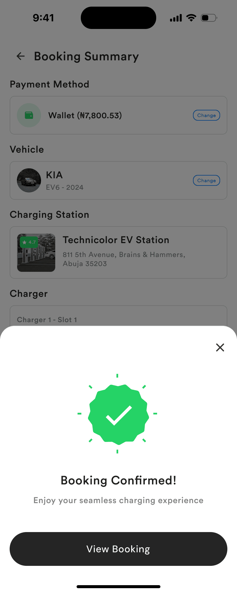
4 BookedConfirmed, with the booking one tap away
Decision 2
Make the cost of changing plans clear, because drivers told us it wasn’t
Booking asks drivers to commit early, and plans change. A private EV owner tested the app and involved his fleet drivers, and they pointed out that the booking experience did not provide proper cancellation information.
In response, I added details covering cancellation fees, refund eligibility and cancellation timing, and made the fee impossible to miss. The design states it at two points: on the slot screen before payment, and again in the cancel confirmation (“Your booking fee will not be refunded. Are you sure you want to cancel your reserved slot?”). No one finds out afterwards.
Cancelling asks for a reason from a short list: change of plans, high charging cost, station too far away, charging time not suitable, weather, technical issues at the station, found another station, or other. Drivers get a quick exit, and operators learn why slots go unused, which answers the brief’s “metrics, to whom?” with something actionable. Cancelled bookings keep their reason and offer “Book again”.
Before and after testing
What changed after the fleet drivers said cancellation wasn’t clear.
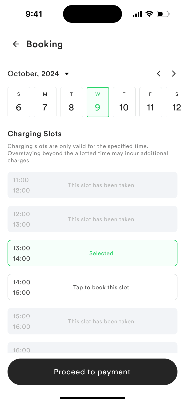
1 Before testingNo cancellation information
2 AfterThe fee is stated before payment
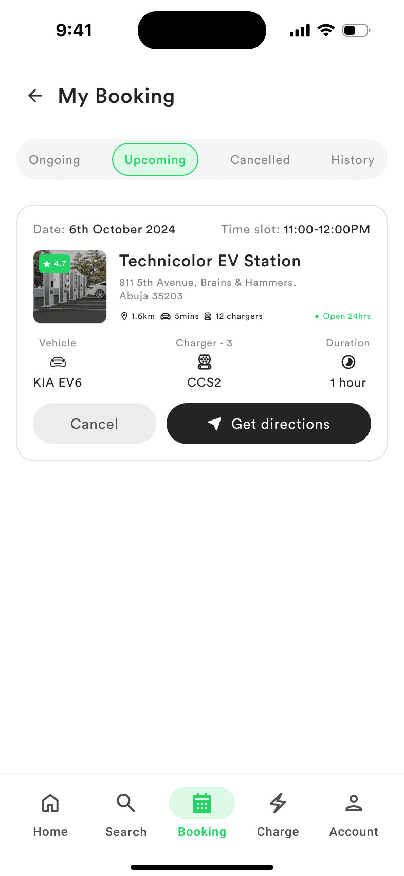
1 Upcoming bookingCancel sits next to directions
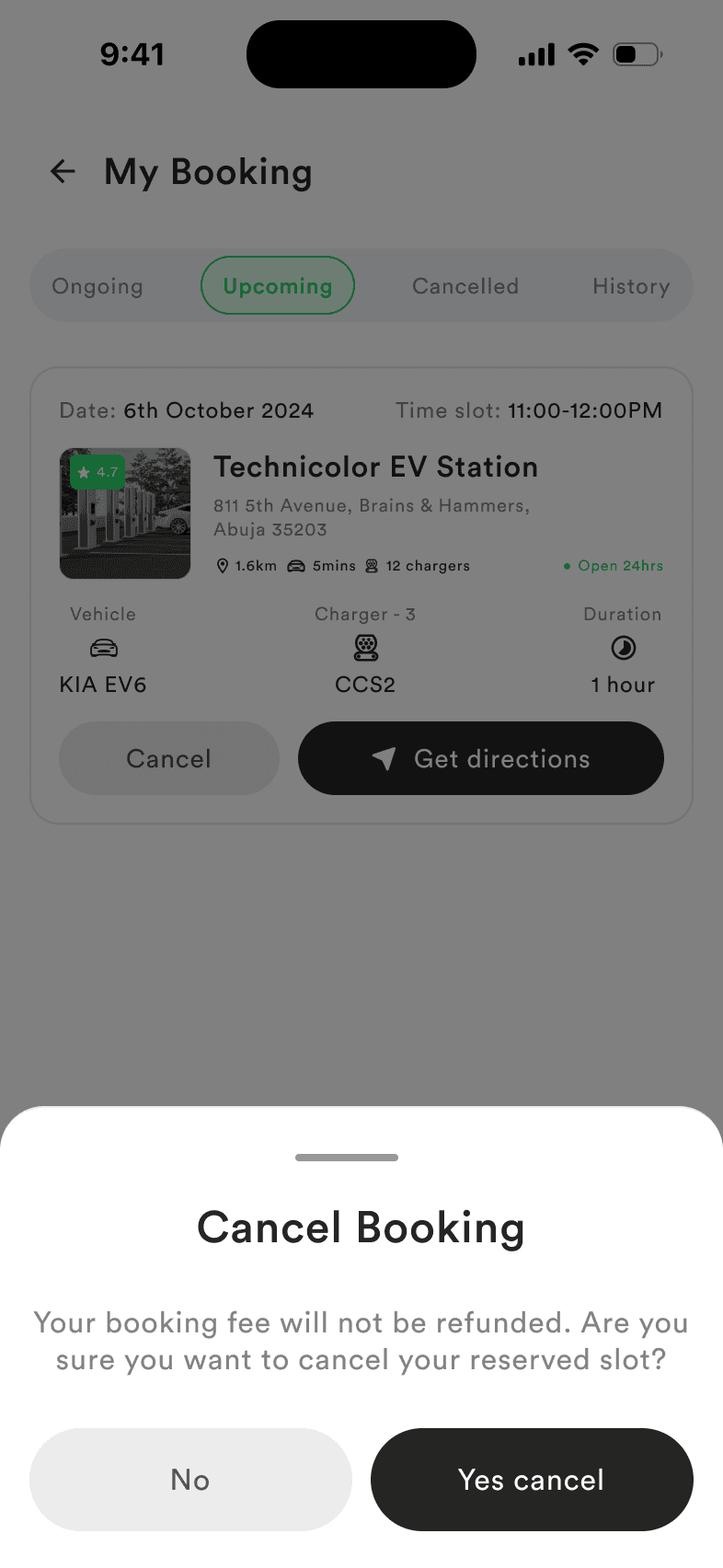
2 ConfirmThe fee, stated again
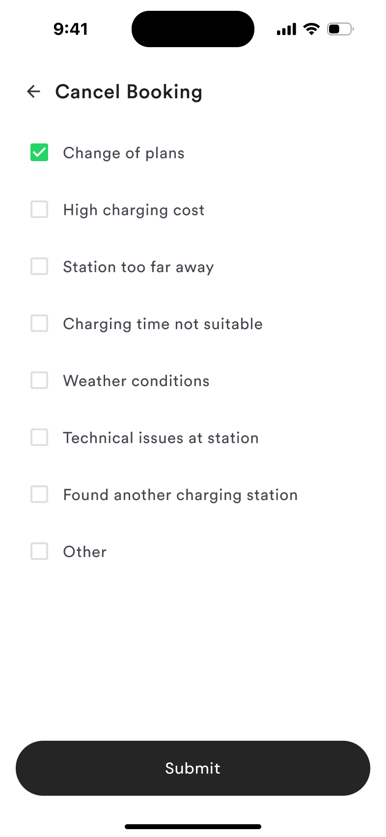
3 Say whyOperators learn why slots go unused
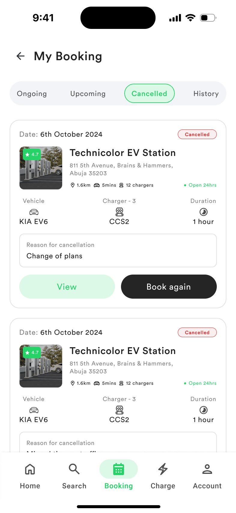
4 CancelledThe reason is kept, with Book again
Decision 3
A wallet, protected by a PIN
The brief raised the question of a code to confirm identity and payment. I answered with a 4-digit wallet PIN, set up once and entered to authorise each transaction, so a phone left unlocked at a charger cannot spend the driver’s balance. Mismatched entries get a plain message: “PINs do not match. Please try again.”
Drivers must fund their wallet before booking, so adding money had to connect to making a reservation. When the balance is too low, the payment screen says so and offers a top-up in place, rather than failing at confirmation. The wallet can be topped up by card, bank transfer, PayPal, Apple Pay or Google Pay.
Securing the wallet
Set up once; low balance is caught before paying, not at confirmation.
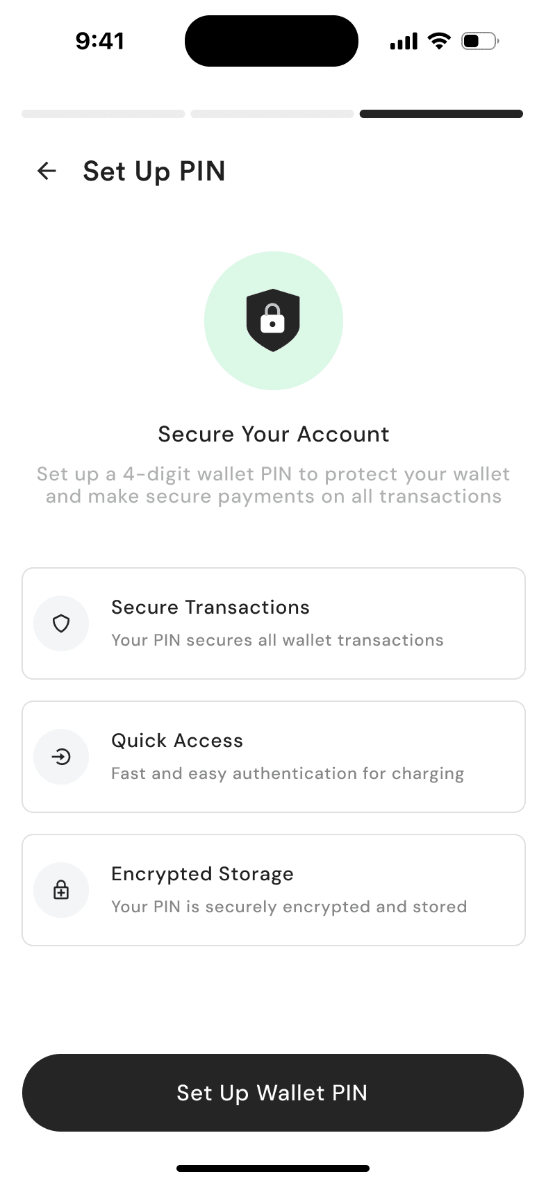
1 Why a PINThe benefits, before asking
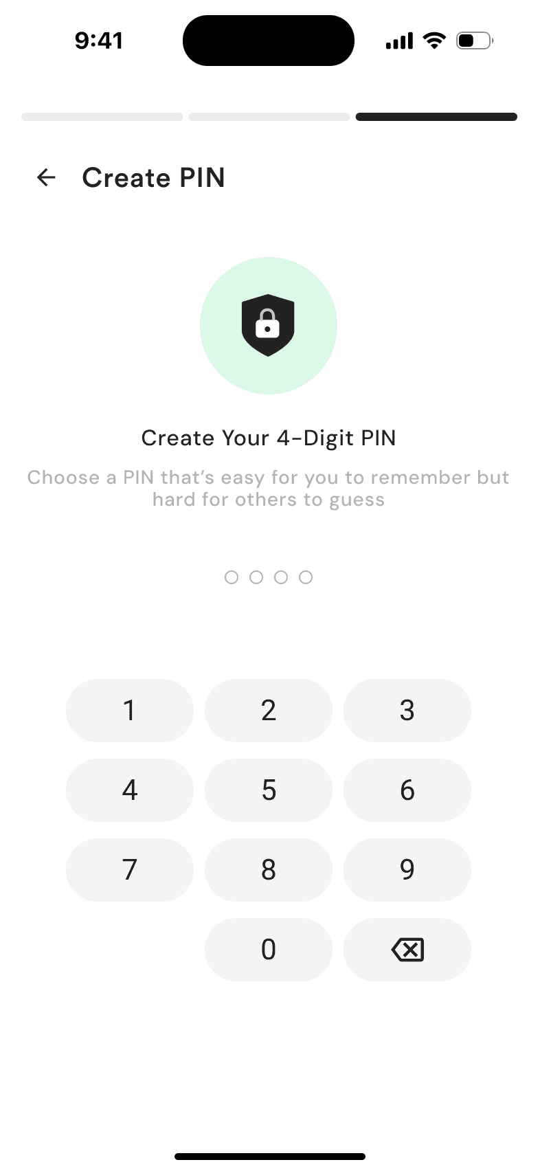
2 Create PINFour digits, set once
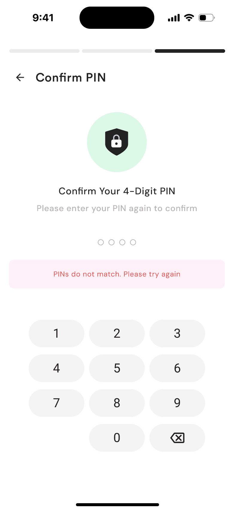
3 MismatchA plain message
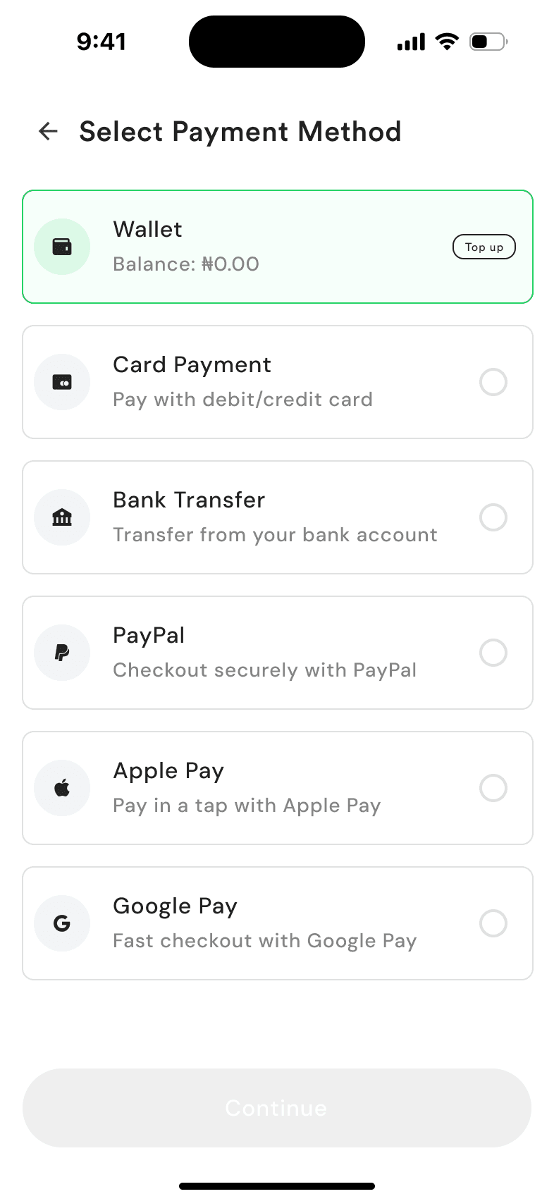
4 Low balanceTop up, right where you pay
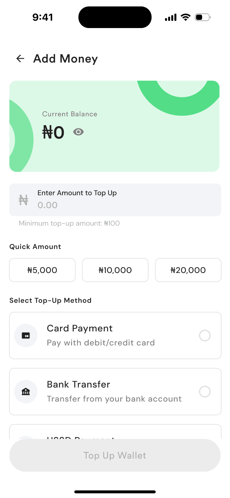
5 Add moneyQuick amounts and a clear minimum
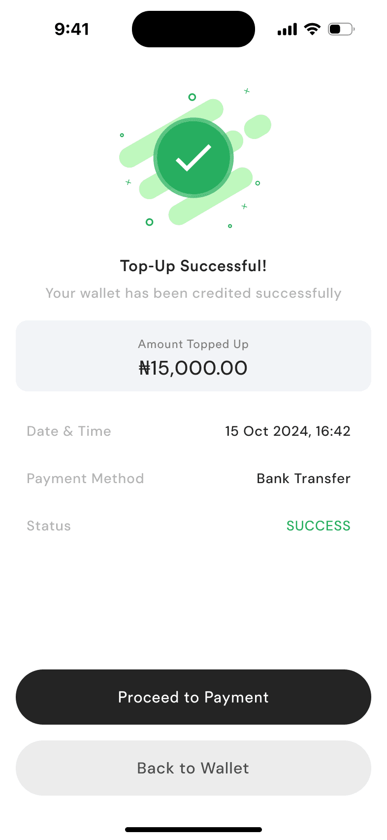
6 Topped upStraight back to paying
Decision 4
Design for the driver at the charger
Drivers add their vehicle once, including its charging port type, and station details show the connector on each charger slot, so the driver books a charger their car can use.
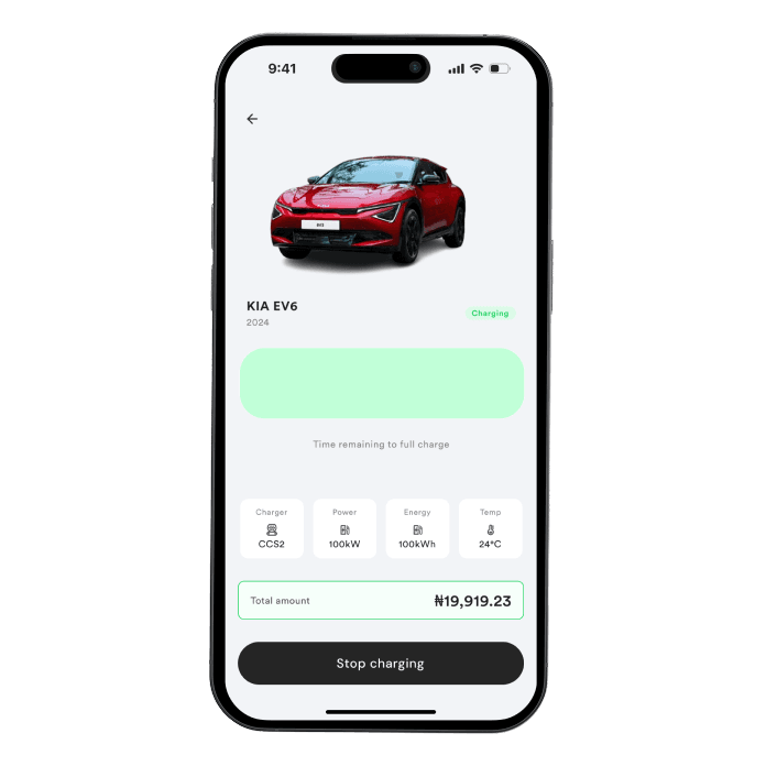
At the charger, the driver is holding a cable, not studying a screen. The charge screen starts with one instruction, “Plug in first to start charging”, then a single “Charge vehicle” action. While charging, the battery percentage is the largest thing on screen, with time remaining and the running total below it, and a clear stop control. The session ends on a “Charging complete” screen that lists any idle fee, so overstaying has a visible cost.
At the charger
One instruction, one action, then progress readable at a glance.
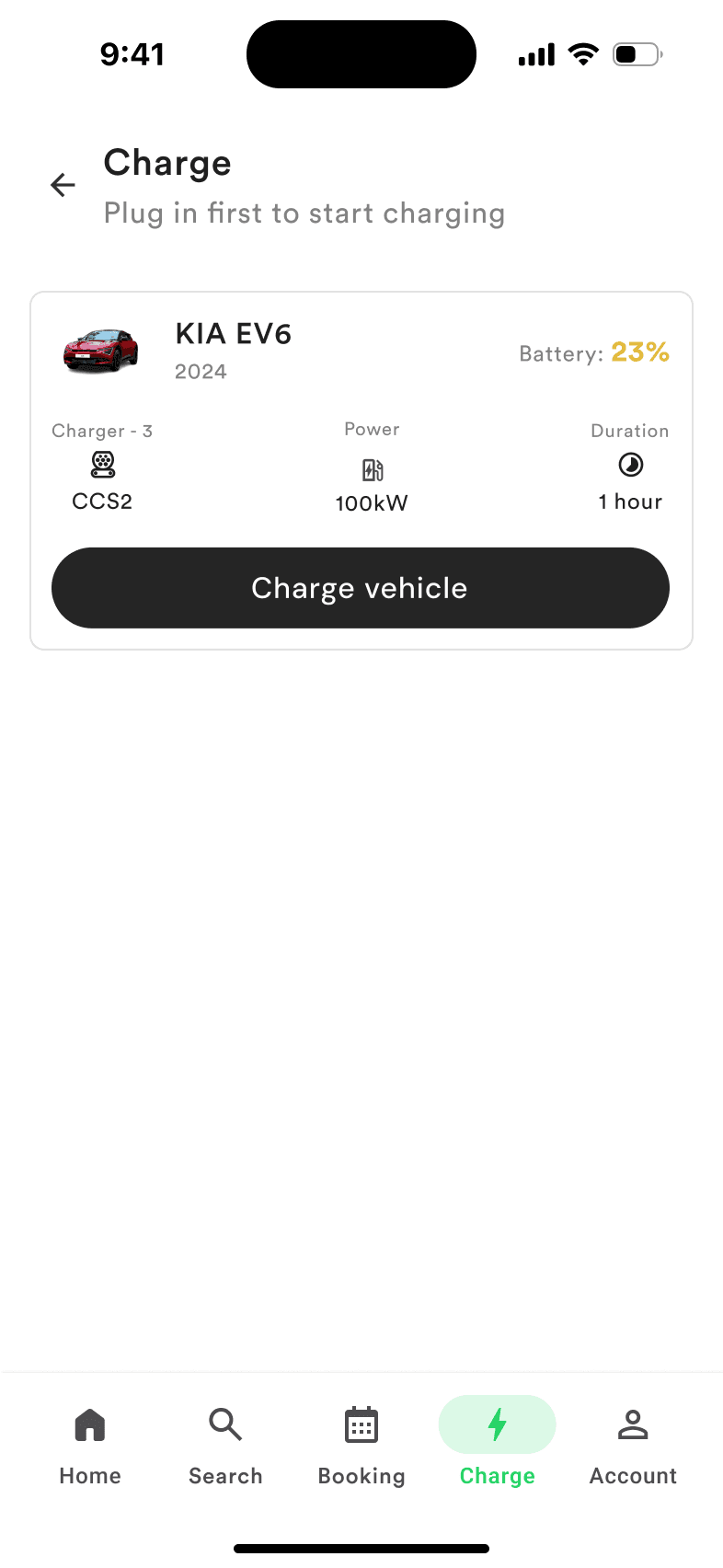
1 Plug in firstOne instruction, one action
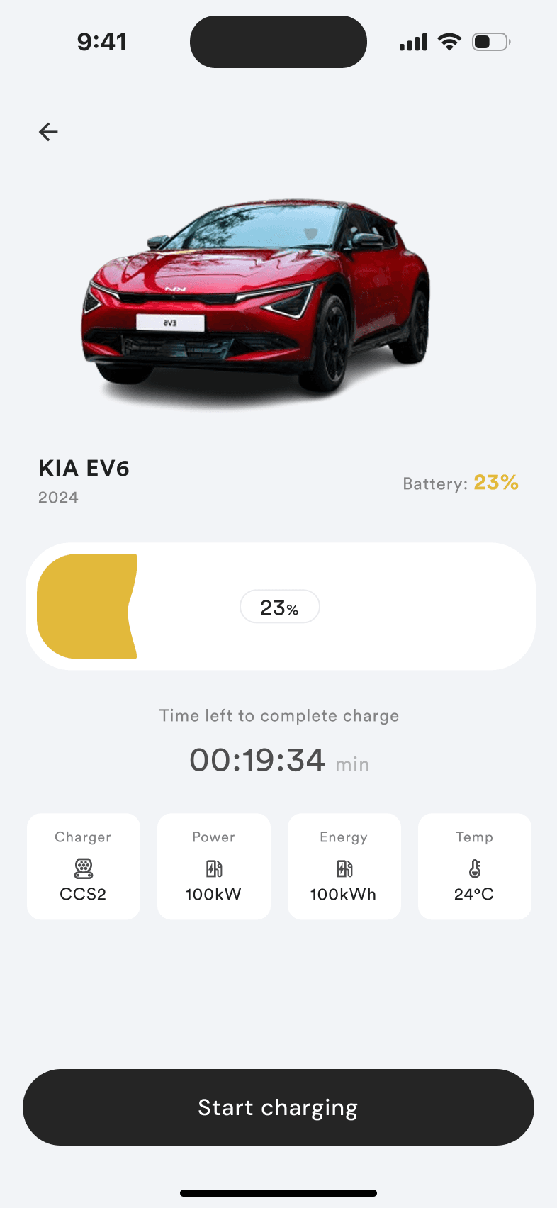
2 StartBattery level is the largest thing on screen
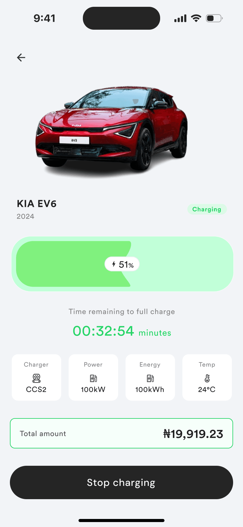
3 ChargingTime left, running total, a clear stop
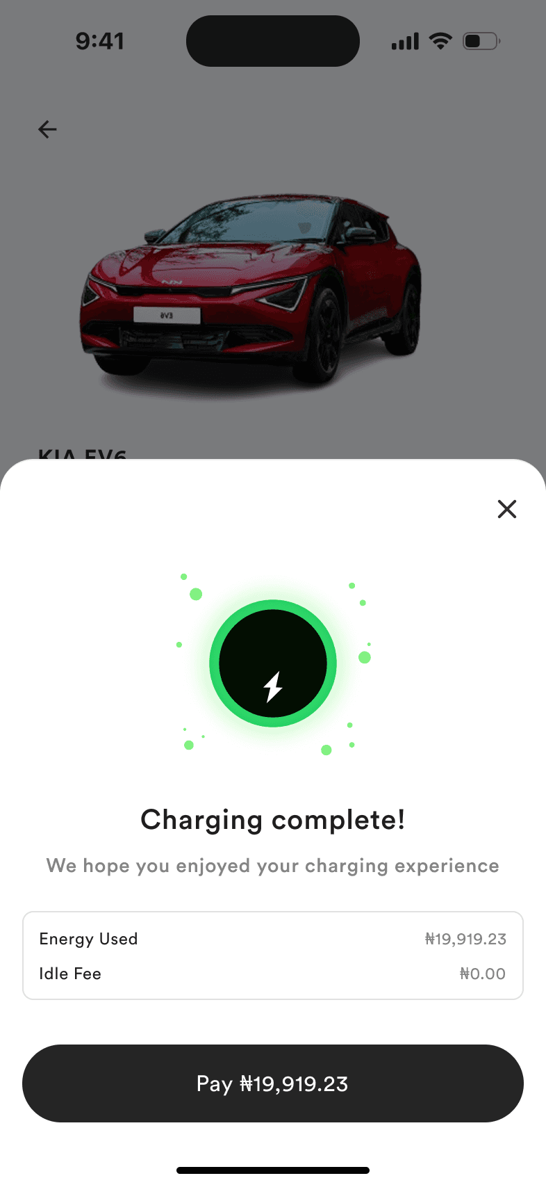
4 CompleteThe idle fee, before paying
Where it stands
SureChargeX is live on mobile and web; the website’s job is to explain booking-first charging and get people into the app. I don’t have post-launch data yet, and no measured usability or adoption improvement is claimed here. The brief asked whether metrics matter and to whom; these are the ones I’d use to judge the design:
- Booking completion: drivers who start a booking and confirm it.
- Cancellation reasons: which reasons dominate, from the data the cancel flow collects.
- Overstay and idle fees: whether the slot rules are understood.
- Repeat bookings: drivers who tap “Book again”.
Reflection
What I’d do differently
Completing the main flow is not enough. Drivers also need clear information when plans change, money is involved, or a session ends.
Next, I would check the revised cancellation details with drivers, and test the transitions (confirmation, cancellation, completion) at a charging station, where attention is split between the phone and the charger. I would also revisit how a booking-first, account-based model fits NEVI’s expectation that public charging should not require membership, for example a guest or pay-at-charger path.
See the website in action.
Visit SureChargeX (opens in a new tab)