Product design · Payments & logistics
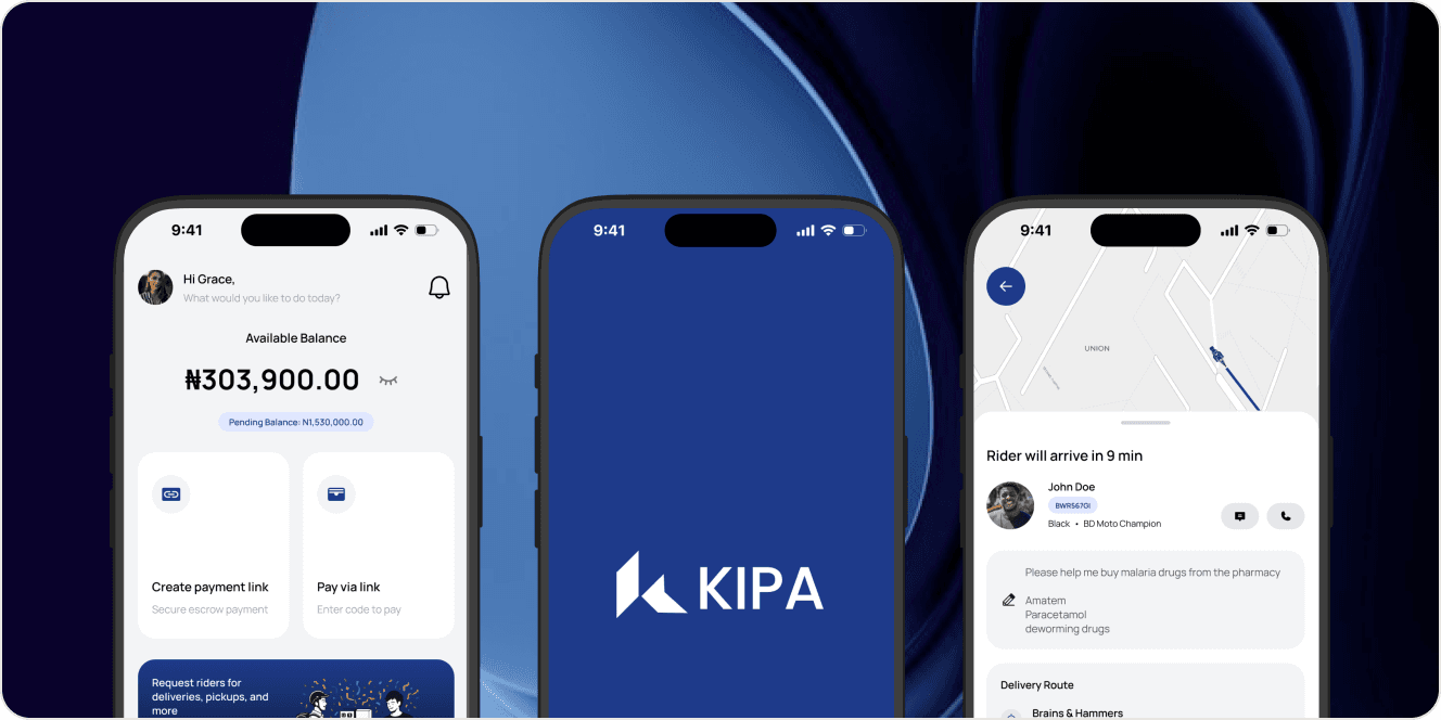
KIPA
Helping people pay with confidence and manage everyday deliveries in one app.
Problem
An online transaction involves more than making a payment. Buyers need confidence that their order will arrive as expected. Sellers need clarity about when they will receive their money. Arranging delivery adds another layer of coordination.
KIPA brings payment protection and errand services into one product. Its design challenge is to make that relationship understandable: what happens to the money, what happens to the item, and what each person needs to do next.
For someone booking an everyday errand, the priority is different. They need a direct way to request a rider and follow the task. Both experiences belong in the same app, but they should remain easy to distinguish.
2 core services
Protected payments and on-demand errands, connected through one mobile experience.
Role
I designed KIPA’s mobile experience, bringing its escrow and errand services into a shared interface.
The central design consideration was clarity. Payment protection introduces steps that people need to understand before committing money, while errand booking needs to feel straightforward and practical.
Design process
I approached the experience through two starting points: someone who wants to transact and someone who needs something picked up or delivered. Separating those intentions gave the flows a clearer purpose.
For the payment journey, I focused on the moments where uncertainty could build. What does the buyer need to know before paying? What does the seller need to know while waiting? What happens when delivery is complete, or when something is wrong?
I used those questions to think through the information needed at each stage, the action available to each person, and the confirmation that follows. The aim was to make the process understandable without making every screen carry every rule.
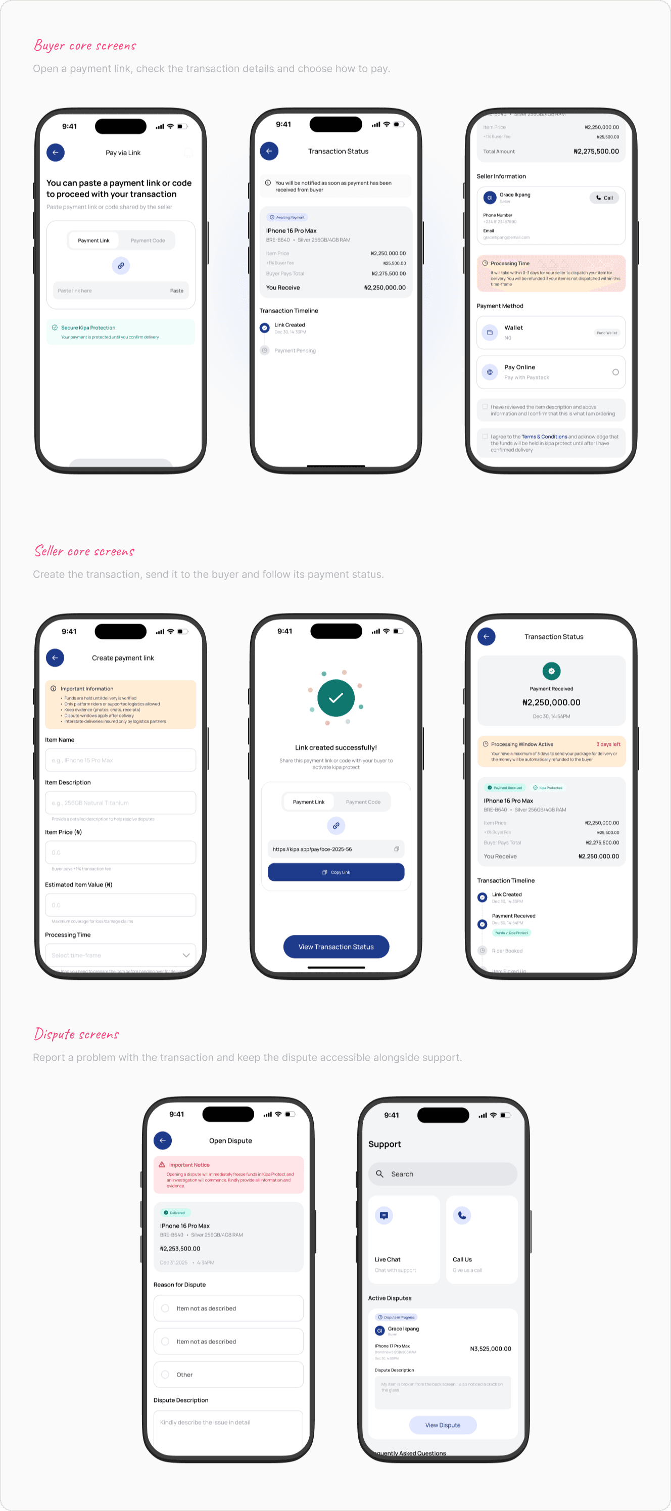
People should know where their money stands, not have to guess.
Solution
Make payment protection understandable
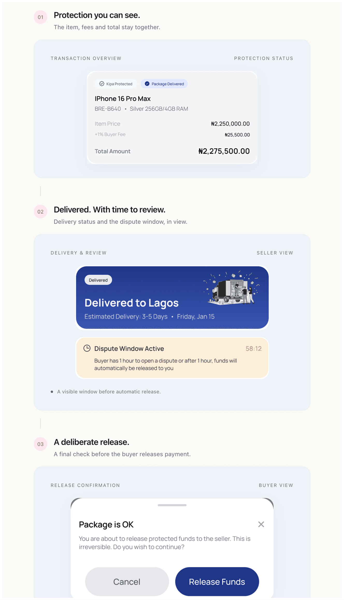
Kipa Protect holds payment until delivery is confirmed. That makes the distinction between paying and releasing funds central to the experience.
A clear interface needs to explain what the current payment status means and what must happen before it changes. Reassuring language alone is not enough when someone is deciding whether to commit money.
Keep the delivery journey visible
KIPA supports rider booking for deliveries, pickups, and errands, alongside delivery tracking. These features help connect a request to the activity happening beyond the screen.
The design story is about maintaining continuity. Once a task has been requested, people still need context about its progress and completion.
Make room for problems
The product also provides dispute support. Confirmation and dispute actions carry different consequences, so their meaning needs to be clear before someone chooses. This is an important part of the case study: the experience should account for a transaction that needs attention as well as one that finishes successfully.
Lessons
Trust is built through understandable states and clear consequences. A polished payment screen matters, but the explanation before a commitment and the feedback after it matter just as much.
For a future iteration, I would test whether buyers and sellers can explain the payment status in their own words. I would also look closely at whether the confirmation and dispute paths are easy to distinguish when a delivery does not go as expected.
See the website in action.
Visit KIPA (opens in a new tab)